
#
Visuals
The visuals tool creates financial charts and graphs to support your analysis. Xynth can generate visualizations for any data you're working with, from basic price charts to complex multi-dimensional displays.
#
How It Works
Xynth generates visualizations based on your analysis needs. The tool works with whatever data you have - stock prices, options metrics, financial ratios, or technical indicators. Charts help clarify complex data and maintain understanding during longer research sessions.
📊 Any Chart Type 🔍 Data Clarity ⚡ Quick Generation
Common use cases:
- Stock performance comparisons and trend analysis
- Options data visualization (Greeks, open interest, volume)
- Correlation matrices and sector heatmaps
- Technical indicator overlays and signals
- Portfolio allocation and risk breakdowns
- Earnings trends and financial ratio analysis
#
Examples
Here are just a few examples of what Xynth can create with the visualization tool:
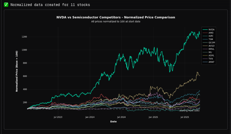
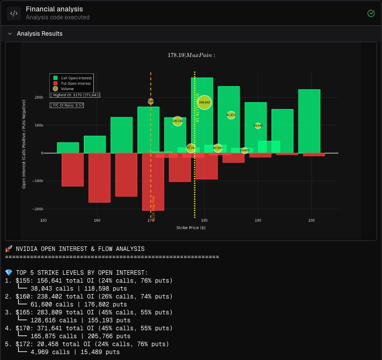
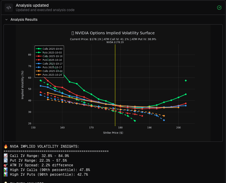
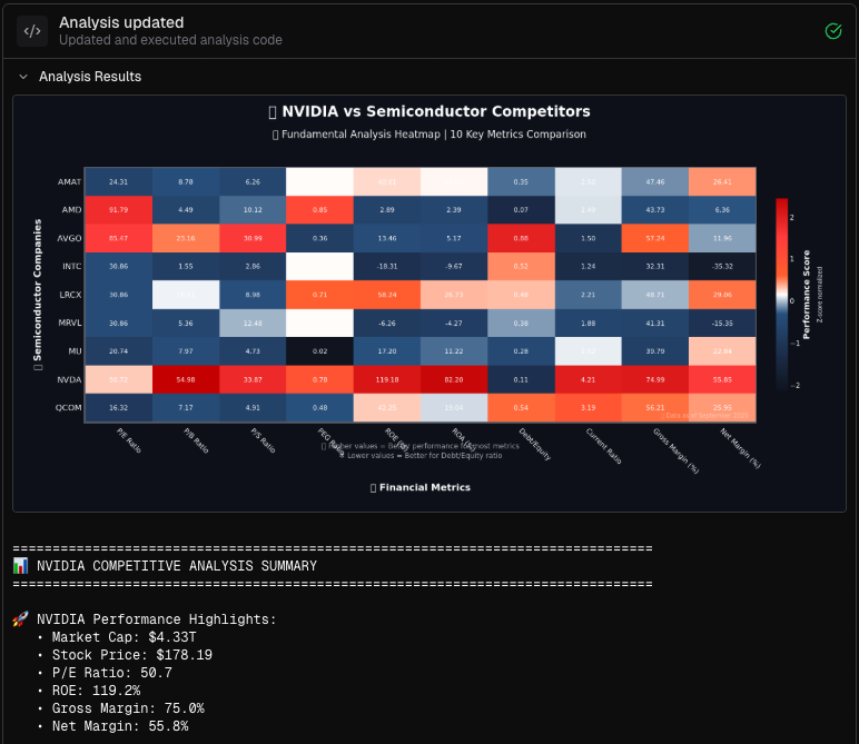
Chart types include line plots, bar charts, scatter plots, heatmaps, candlestick charts, surface plots, and statistical distributions. Visualizations adapt to your specific data and analysis context.
How to trigger: Ask Xynth to "create a chart," "visualize," or "plot" your data, or select the visuals tool from the tools tab.
#
💡 Pro Tips
- One visual per image - Request visuals to be spaced apart for clarity
- Prepare data first - Ensure your analysis is solid before creating visualizations
- Be specific - Describe exactly what you want to see for better results
- Use during research - Charts help maintain understanding in longer analysis sessions
#
⚠️ Important Notes
- Complexity trade-offs - More complex visuals can be prone to errors; start simple when needed
- Iterative approach - Build complexity gradually rather than requesting everything at once
- Data quality matters - Clean, well-structured data produces better visualizations
Related: Use with Fundamentals, Market Screener, or Backtesting for comprehensive analysis.